
Crossfit Tucson is in the process of rebranding to Transform U Tucson. The focus of the business is shifting from Crossfit to a more general total body workout and transformation for their clients, with a focus on not only exercise, but also overall health and nutrition.
This logo reflects client desires, as well as a nice negative space graphic of two trainers (the uppercase T letters) pulling a skinnier person out of the "U" between. The symbol is also clean, recognizable, and easy to use in a variety of formats, as shown here.
I am responsible for all design and creation of the logo and brand.
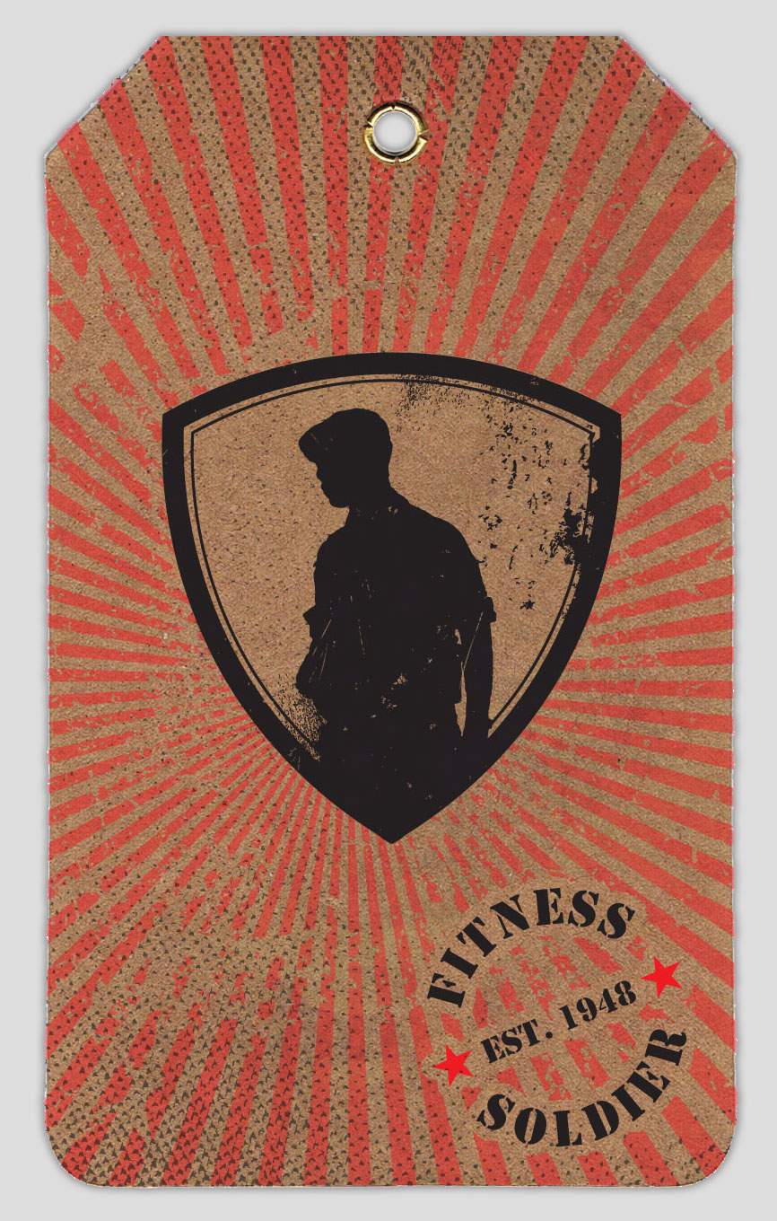
In addition to the boot camps, Fitness Solider also might someday be a clothing line, so I created this tag to be attached to each piece.
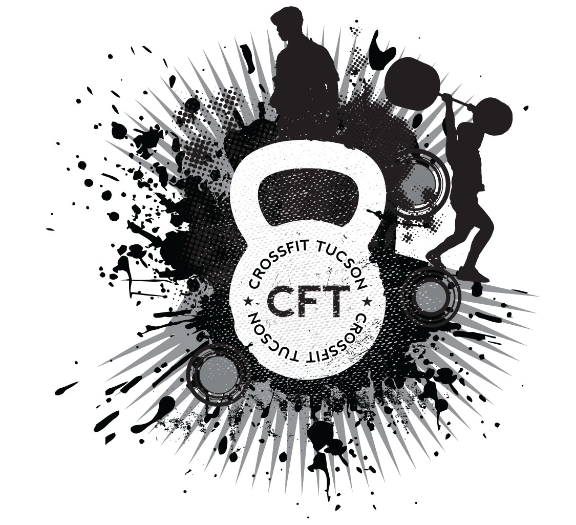
The folks at CFT are fans of the distressed pop art style that you see around a lot lately. This was a piece that I put together in that style. It features silhouettes of the 2 co-owners.

This was a logo and card design for 2 grad students at the University of Michigan who started a company built around their invention of a very cool and unique lumbar support brace. They were very specific as to what they liked and wanted, and the resulting logo made them quite happy. I think it's a nice one myself, and very representative of the business and what they do.
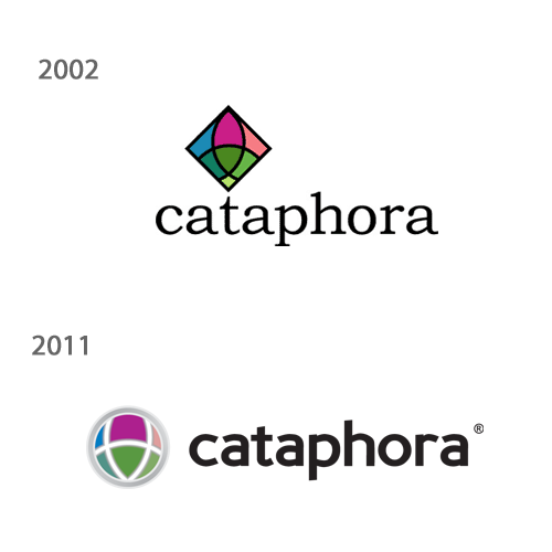
I could file this under both 2002 and 2011, as I created both the original logo as well as the updated version.
I learned the hard way that an 8-color logo is not the best idea for a startup trying to save money on printing costs, but this logo was worth it. It was a popular logo that we received a lot of compliments on.
The 2011 re-do was after we divested a portion of our company. We wanted to have an updated brand that still reflected the original identity. The circle also had a few less colors, which was a nice bonus.
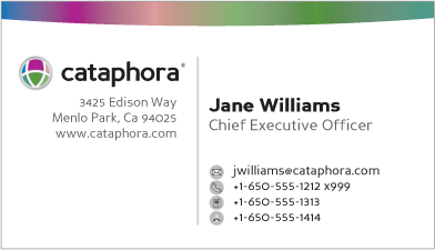
Our re-branding card design. I wanted to have something that was a bit more buttoned down, but at the same time keep a small bit of the design flair of a west coast Silicon Valley software company.
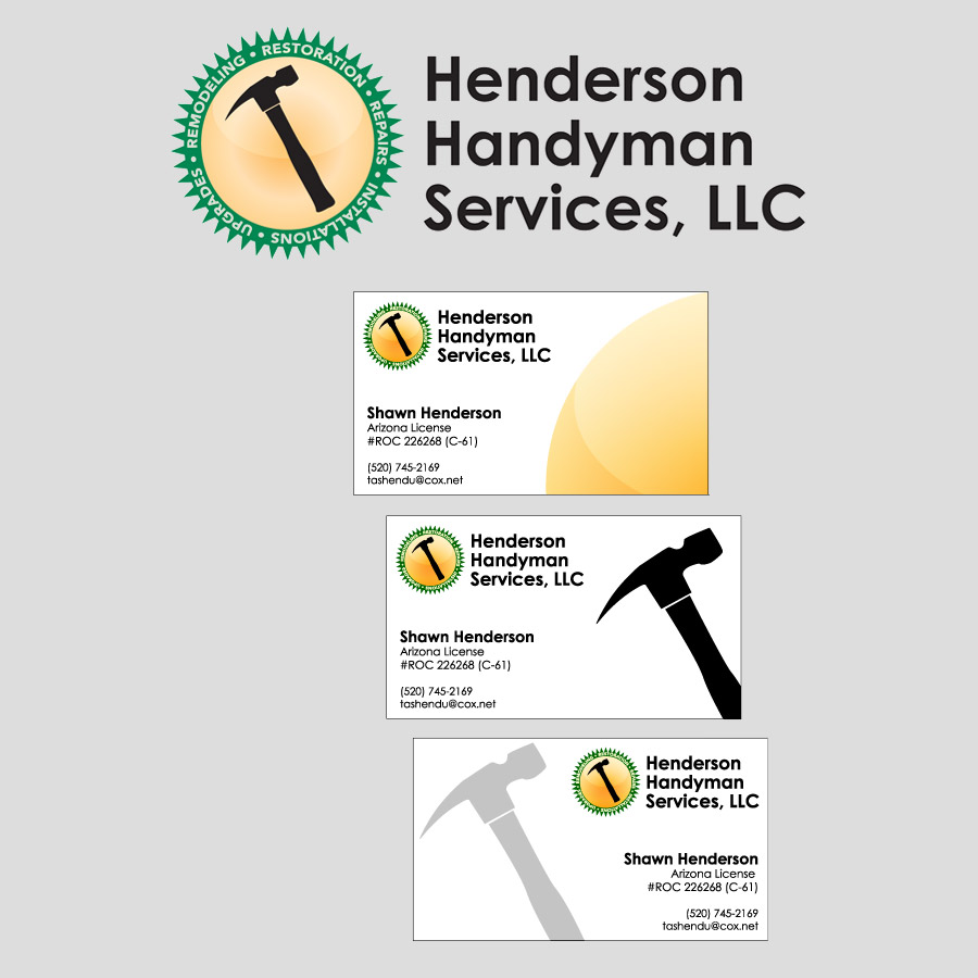
Henderson Handyman Services is the best in the business, and they do all the work around my house. I did a bit of trade at one point to help give them a brand and identity to build on.
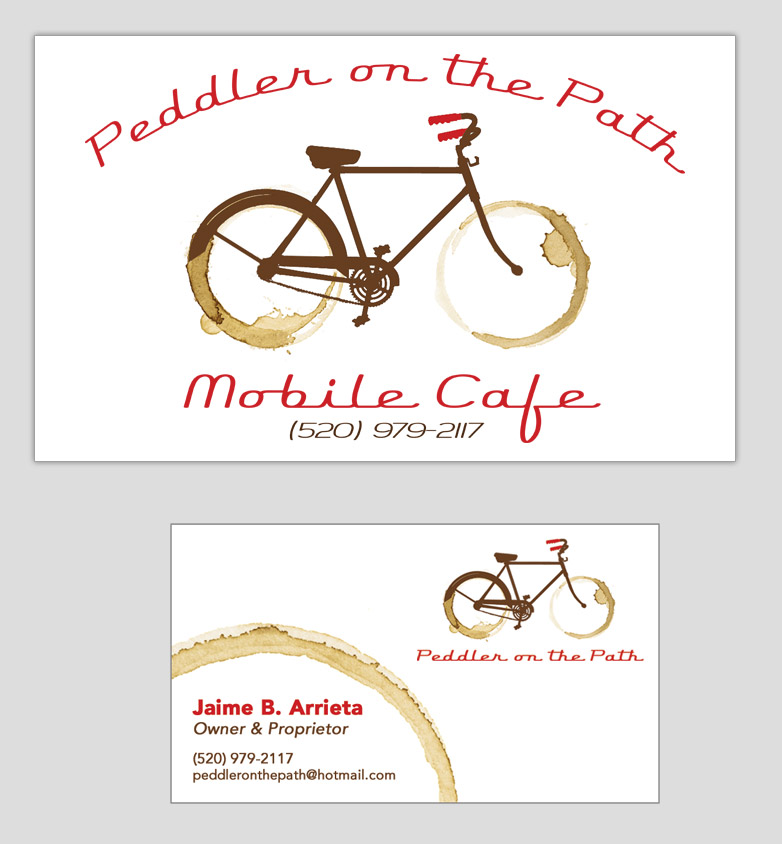
A friend of mine started up a coffee truck that was geared towards cyclists (he is one, and knows how much coffee that crowd drinks), and he needed a logo and some cards.
I really have always loved the coffee stain wheels on this, even though the coffee stain concept has been done a lot. They just went really well with the old school bike and typeface in this logo.
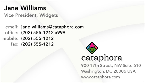
I dread the plain white business card, and here I avoided that with the subtle background pattern, which is a cutout of the border of the diamond portion of the logo.
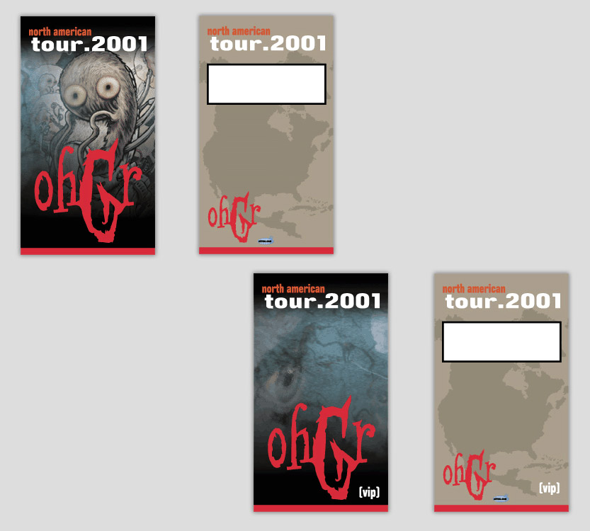
Ohgr (he of Skinny Puppy fame) went out on tour in 2001, and a friend was playing with them for the tour. I was lucky enough to get to make the tour badges for them. The art itself on the front isn't mine, but the design and the rest of it my creation.

A collection of logos from our Silicon Valley startup.
The target for the main company logo has since been very strongly associated with (surprise) the Target corporation, but back in 1999, they were not as much of a nationwide presence as of yet, and our logo didn't really conflict with that brand. These days, however, it wouldn't work.

During a trip to Malaysia, a fellow Troba employee reported that this business card was being used as a sample of "good business card designs" in a friend's art class. Apparently somebody had returned from the U.S. (and an interaction with Troba) with one of these cards.
True or not, it still sounds good, so I'll re-tell it here.

Ohgr (he of Skinny Puppy fame) went out on tour in 2001, and a friend was playing with them for the tour. I was lucky enough to get to make the tour badges for them. The art itself on the front isn't mine, but the design and the rest of it my creation.
Ya. Animated GIF files were once considered really hip. I even remember when they had to be server push. So ha.